Screen Overview & Terminology
Below are some of the most common terms and standard functionality within the ProLink application's screens.
Screen Element | Description | Example |
|---|---|---|
Menu bar (toolbar) | Provides buttons that allow you to perform actions specific to the screen. |  |
Screen title | The title of the application section you have accessed. |  |
Header | Information to help you confirm what deal or fund you are working with. |  |
Tabs | The tabular format groups similar data, helping to reduce scrolling and improve application performance. |  |
Section header | Within a screen or tab, similar data is grouped together and identified with a section header. | 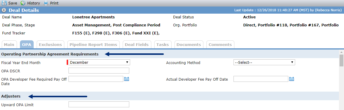 |
Section/grid menus | Some sections and grids include buttons specific to the data in the section or grid. | 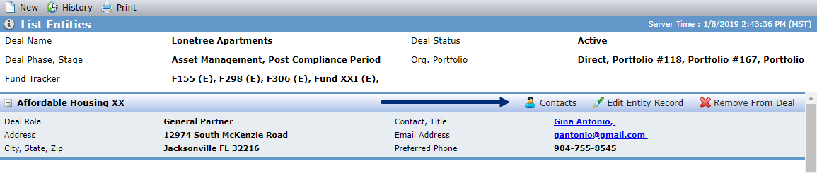 |
Grids | The basic grid displays data in columns. By clicking the column header title, you can control the way data is sorted in the grid. Clicking a row in the grid opens the record. In select grids, such as on the Unit Mix screen, you can edit the data directly in the grid. Enhanced grids also offer totaling and grouping of data. Select an option in the drop-down list to group data. Totals at the bottom of the grid are calculated from the data shown in the grid. |  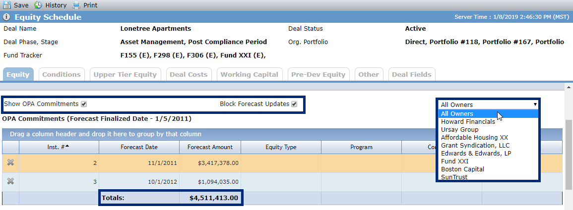 |
Required fields | A red bar indicates the field is required. You cannot save until all required fields are populated. A blue bar indicates a conditionally required field; the field is required when the record meets certain criteria. |  |
Read-only fields | Gray shading indicates you cannot enter or select data in the field. The data displayed is calculated, retrieved from other sections of the application, or updated only through SmartDox. |  |
Drop-down lists and picklists | A field with an arrow to the right is a drop-down list, and the values of the list are collectively called a picklist. |  |
Date picker | Clicking the calendar icon to the right of the date field opens a calendar of the current month, from which you can select the applicable date. You can also manually key a date in the field. |  |
Hyperlinks | Fields or data shown in blue and underlined font represent hyperlinks. Clicking the link redirects you to a different location in the application. |  |
Expand/collapse | Some areas in the application contain listings of data that can be collapsed to show only the title of the group or expanded to show the detailed data. | 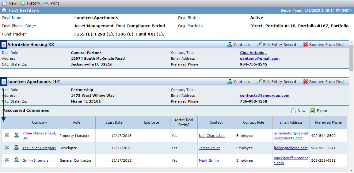 |